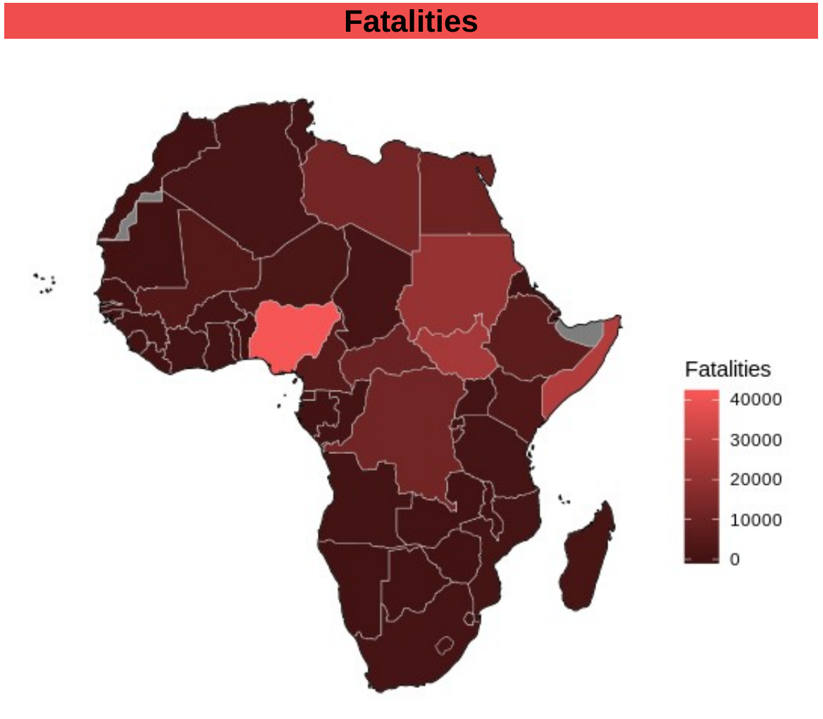
Africa Acled Visualization
This was a project completed for a University assignment. Our task was to find an interesting dataset and visualize it in a meaningful and in depth way. I searched through kaggle and found a dataset for conflicts in Africa, then found its source, the ACLED website, and obtained even more up to date data. I used R for the visualization and combined the ACLED data with other datasets from the world bank, such as GDP and Population, to gain more understanding of the data and attempt to find hidden meaning.
What I Learned
- Data Visualizations with Maps (GiS, Shape Files).
- Preprocessing of map data.
- Map projection types.
- More in depth knowledge of GGPlot.
- African Geography.
- An understanding of conflicts within africa.
What I Would Change
I would like to format the report to be more professional, use cleaner plots and have a more cohesive, meaningful colour palette. The original idea was to make it seem like a booklet to give out at or before a conference to allow people to educate themselves on the topic of conflicts in Africa, I would have liked to achieve this quality. It would have been better to build the plots in R/ggplot and performed a passover using illustrator to better present them and fit them into a booklet.
comments